Wednesday, October 28, 2009

Modern Double Happiness Wedding Invitations

Going all the way back to December of 2008, I was contacted by Nicole, a San Francisco bride, about creating invitations and stationery for her Lake Las Vegas destination wedding. She wanted something "simple, classic, and slightly exotic" for her Asian-inspired wedding. Double happiness Chinese characters were incorporated into her design, along with some decorative flower blossoms and branches. The red and silver elements of her color theme were present in the double cardstock backing for the invitation, and in the silver envelopes for both the main invitation and the response card.

A custom map was created for Nicole, showing Lake Las Vegas in relation to the Vegas Strip and the LAX Airport. This was displayed alongside the wedding weekend itinerary which included a golf tournament and a welcome party. All cards were made of a pearlescent white metallic cardstock.

After a fun ten months of working with Nicole, she just got married this past weekend! Nicole and Gary, congratulations!! I'll be sharing her other wedding stationery elements soon. If you're interested in this invitation for your upcoming wedding or special event, email me at info@pinkorchiddesigns.com.

~Emilie

Friday, October 23, 2009

Unique lettering for envelopes and more!

Ever since I was young, I have really loved lettering. I started doing traditional calligraphy in the fourth grade, and learned the importance of spacing. I practiced my signature all of the time, and would even get asked by classmates to write their name "as a signature" so they could see what it would look like. I made huge banners in block letters for homecoming and spirit week in high school, and continued to do banners in college at Carnegie Mellon.

More recently, I've been doing lettering on envelopes. Taking the time to write out someone's name in style is a way to give a great first impression. For every card I send out, whether it's a thank you, bithday, or wedding, I always spend a little time to make it extra special. Below are some photos of lettering examples.

Block lettering: clean and modern

Cursive lettering: whimsical and fresh

This lettering is great for envelopes, but would also work well if you're looking for a unique style for tags, place cards, signs, or anything else. My lettering services are available through Pink Orchid Designs. Please email me at info@pinkorchiddesigns.com for pricing!

~Emilie

Tuesday, October 20, 2009

Edible Arrangements: Tasty and Beautiful

If you are ever in need for a practical gift that is both beautiful and tasty, Edible Arrangements has some really gorgeous treats. Their displays of fruit will brighten up any room and would be perfect for a bridal shower, or an afternoon engagement party.


If you want to try some fruit from Edible Arrangements, they are actually giving out free boxes of chocolate dipped fruit here. The promotion ends on 11/16/09 and is limited to the first 100,000 participants. Delivery costs are not included. I absolutely love chocolate covered fruit, and want to make sure everyone can take advantage of this amazing offer!

~Emilie

Carnival Theme Birthday Invitations

Hudson's Birthday Invitations: Part II

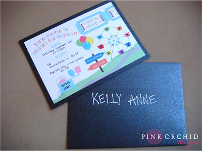
In my previous blog entry here, I went through the design process for some pretty cool Star Wars birthday invitations. When else would I have the opportunity to create glittering light sabers? Then, I found out that Hudson changed his mind about Star Wars, and what did he pick instead? A Carnival Theme! Melissa said that there would be things like cotton candy, a jump house, and face painters. I instantly got thinking about carnivals that I've been to and after discussing some other elements with her, it was time to sketch out some ideas.

Everything was so different than the types of things I draw for wedding invitations, so this was a fun challenge for me. I started sketching out tents, admission tickets, ferris wheels, cotton candy, balloons, and little signs to point to other fun activities. Then I began trying to come up with ideas on how to put all of those ideas on one invitation without it looking really randomly placed. The main issue that I ran across was that there were too many ideas to fit on one 5" x 7" invitation, especially because I had to include information like when and where the party was. So, I opted out of the tent, and came up with the following invitation.

I created blue and orange carnival admission tickets with "Hudson" in place of the ticket numbers. The ferris wheel seats had "H" on them to personalize them for Hudson's birthday. The lights on the ferris wheel were hand-glittered in orange and blue to match the lettering. There were signs pointing to different activities that they will actually have at the birthday party, with some colorful balloons tied to the signs. There was also a cotton candy machine where I hand-glittered the cotton candy in blue and pink. To link all of the elements together, they are all on a path surrounded by grass, so it looks like the ferris wheel is in the distance, and you are only seeing one small part of the carnival.

Aren't these invitations super cute? They are made of a pearlescent white metallic cardstock, with an onyx black metallic cardstock backing. The onyx black metallic envelopes matched the invitation perfectly, and the 35 guest names were hand-lettered in block letters and white ink. Melissa was really happy with how these turned out, and in my opinion, Hudson was able to be the coolest five-year-old to pass out invitations in black metallic envelopes to his classmates at school. If you're interested in these invitations or another custom design, contact me at info@pinkorchiddesigns.com!

~Emilie

Thursday, October 15, 2009

Star Wars Birthday Party Invitations

Hudson's Birthday Invitations: Part I

Or should I say Episode I? I recently received a request from Melissa to design her son's 5th birthday party invitations. She told me that Hudson wanted a Star Wars themed party, and other than rule of "wanting them cute", I was free to come up whatever I wanted. Star Wars is pretty different from the normal wedding invitations that I design, so I tried to think of different elements that I could draw out well. Yoda was pretty much out of the question, but I thought some glowing light sabers might do the trick.

Here is the actual sketch that I used to come up with the concept. I drew out different light sabers for Hudson vs. Darth Vader, and also came up with an idea to have a curve of black in the corner of the invitation with stars on both sides. This was to introduce a planet shape effect, and give the illusion that the text and light sabers were actually floating in space.

After working in Adobe Illustrator, I realized that two corners of this planet shape would make the planet look like a football, so I decided to just go with one corner. I found some great Star Wars fonts and made the 5th Birthday Party a Star Wars Episode, starring Hudson of course. The two light sabers were personalized with "H" and "DV" for Hudson and Darth Vader. I also included hand-glittered elements for all of the stars and the light sabers. I also added a few stormtroopers in for fun. This invitation is on pearlescent white metallic cardstock with a onyx black metallic cardstock backing.

So now, why did I name this part I? Well, after Melissa loved this design, and we finalized everything about it, Hudson changed his mind about the Star Wars party, and wanted something else. I told Melissa not to worry, and I would design her a new invitation for the new theme. I decided to make one of these Star Wars invitations for fun anyways so I could share it with you all on the blog, and in my opinion, the actual invitations for part II are even better! Stay tuned to find out what Hudson picked out for his birthday party theme!

~Emilie

Tuesday, October 13, 2009

Hilary and Joe's Elegant Harvard Club Wedding

This past Saturday, Fiona and I were the day-of coordinators for Hilary and Joe's wedding at the Harvard Club in Boston's Back Bay. This venue is absolutely gorgeous and has so much history and charm. The ceremony and reception were both held in Harvard Hall, which has incredibly high ceilings, beautiful chandeliers, and two roaring fireplaces. For the ceremony, there were ivory pillar candles that lined the aisle and the fireplace mantle, Chiavari chairs for 210 guests, and they were married by a Jewish Rabbi and a Unitarian Reverend. All of the flowers were done by Jennifer Cahill of The Tangled Web, including a huppah decorated with flowers, leaves, and berries in fall colors.

The bridesmaids wore Butter by Nadia dresses where they could wrap the satin fabric to make their own unique styles. The bride was stunning in a beaded wedding dress by Badgely Mischka, and her makeup artist was the talented Kimberly Fosher. The ceremony programs were handmade by the bride's mother, and the invitations matched their fall color scheme perfectly. During cocktail hour, guests perused through an amazing collection of framed ancestor photos. A sign that said "Please find your seat" was placed on the escort card table, where the cards were a variety of chairs that were intricately hand painted by the bride's sister. The reception tables were covered in spice orange silk dupioni linens, with olive satin napkins.

The big highlight was the Horah dance at the beginning of the reception. It was a first for Fiona to have to prevent a guest from carrying delicate armless Chiavari chairs into the crowd, and she immediately signaled over to me where I was ready to push in a napkin and two super sturdy chairs with arms for the bride and groom to be lifted into the air. Once I got into the middle of the crowd with the chairs, everyone knew exactly what to do, and the next thing I know, the biggest cheer came out when the newlyweds were hoisted into the air!

After enjoying a three course dinner of butternut squash bisque, baby arugula salad, and cornish game hen, guests were treated to a French croquembouche dessert and chocolate covered strawberries. The profiteroles were bound with caramel, and some others were dipped in chocolate or vanilla icing. Here is a little preview of the wedding, and as soon as the professional photos from Jamison Wexler arrive, I will definitely share those with you as well!

The wedding went really smoothly, and the entire staff at the Harvard Club was extremely friendly and a joy to work with. Hilary and Joe, it was such an honor to be part of your big day, and have a wonderful honeymoon in Italy!

~Emilie

Friday, October 9, 2009

Cherry Blossom Boxed Wedding Invitations

While the majority of wedding invitations are sent in a traditional envelope, a way to really make a statement to your guests is to have boxed invitations. The box can be sealed with a monogram, a ribbon bow, or even personalized guest tags. It can also hold things like candy, feathers, sea shells, tissue paper, flowers petals, or anything else that you normally wouldn't be able to put into a flat envelope.

This boxed invitation in pink is wrapped in chocolate ribbon and is filled with pink tissue paper. The pearlescent white metallic cardstock invitation includes hand-glittered cherry blossoms with some chocolate ribbon detail in two corners. The bronze metallic cardstock backing matches the response envelope perfectly. The response card includes similar hand-glittered cherry blossom details, with little icons to represent meal choices.

I love receiving boxed invitations because it's like opening up a present. It would also get your guests really excited about attending your upcoming wedding or event! If you're interested in boxed invitations or this cherry blossom invitation design, please contact me at info@pinkorchiddesigns.com.

~Emilie